
XLA
23rd of January 2016 - 7th of February 2016
Gallery One, Edinburgh Palette

XLA is an art project that has spanned the past three years. However it has been 23 years in the making.
The term XLA originates from the medical term for X-linked Agammaglobulinemia, a rare immune condition. The work is themed around life living with a medical condition that has both hindered and helped my growth as a person.
The artwork showcases events in my life, which have had a profound effect on the way I look at the world. From Doctors drawing diagrams explaining my condition to my parents, methods of transfusion, coping with dependency and even personal insight in getting held back, the exhibition documents the past 23 years of my life in rich, striking abstract art.
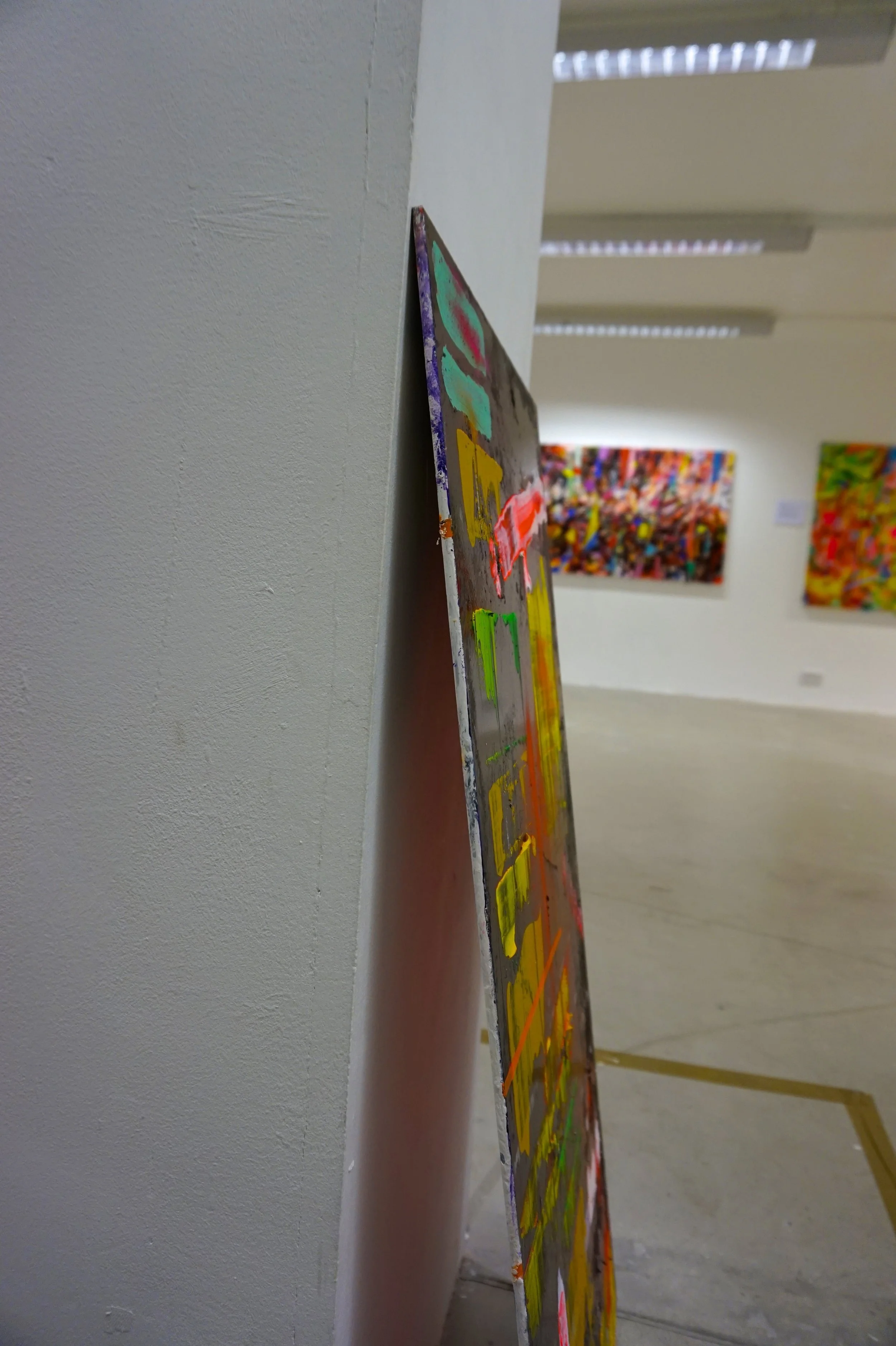
XLA includes large abstract paintings, digital work, photography and some contemporary installation pieces. All the work was created in my bedroom at home and was a direct outcome of how I felt reflecting on my life events.
- MICHAEL WIGHT, 2016 statement.
CHAPTER ONE: YX (2014-2015)
(Acrylic, Oil, Chalk, Indian ink, Polythene sheets, cardboard, charcoal on canvas)
YX is the first painting in the XLA series and it takes my medical history back to 1995, when I was first diagnosed. When my mum was getting a detailed explanation about the format of X and Y-chromosomes and how their structure had led to my condition, a doctor drew her a diagram to explain.
It’s the smallest, simplest piece of paper, yet I still have it till this day. The diagram was the baseline for how YX came about as a document and a template for pattern, reason and cause. It’s how I see the diagram as a story itself; all to do with creation and what makes you. YX is a real introduction into the way I work, mixed media styled, out of control abstraction with hidden messages relating to my history.


CHAPTER TWO: 0 [1 IN 220,00] (2014)
(Acrylic, card, pastel, pencil, dark room exposed paper on canvas)
0 is a direct response to people who think they have it hard. People who feel sorry for themselves and celebrate in the one-person pity party. 0 was originally an idea conceived from being isolated in a lot of aspects of life and how judgment and missing out were a large fear of mine. Everyone goes through tough times and some people struggle in silence looking to celebrate all the small wins in everyday life.
In creating 0 I thought back to when I was younger, unable to do basic tasks by myself, and how water was always seen as a way of washing away the bad stuff, the dirt, the negative and the infection. Using sections of Photographic paper, exposed to light underneath cling film in a dark room, small shapes that look almost water reflective were created on top of the paintings original structure to show how patches and shelter were an important part in growing up. Things always need fixing, and me, in my plastic bubble, witnessed a lot of fixing.
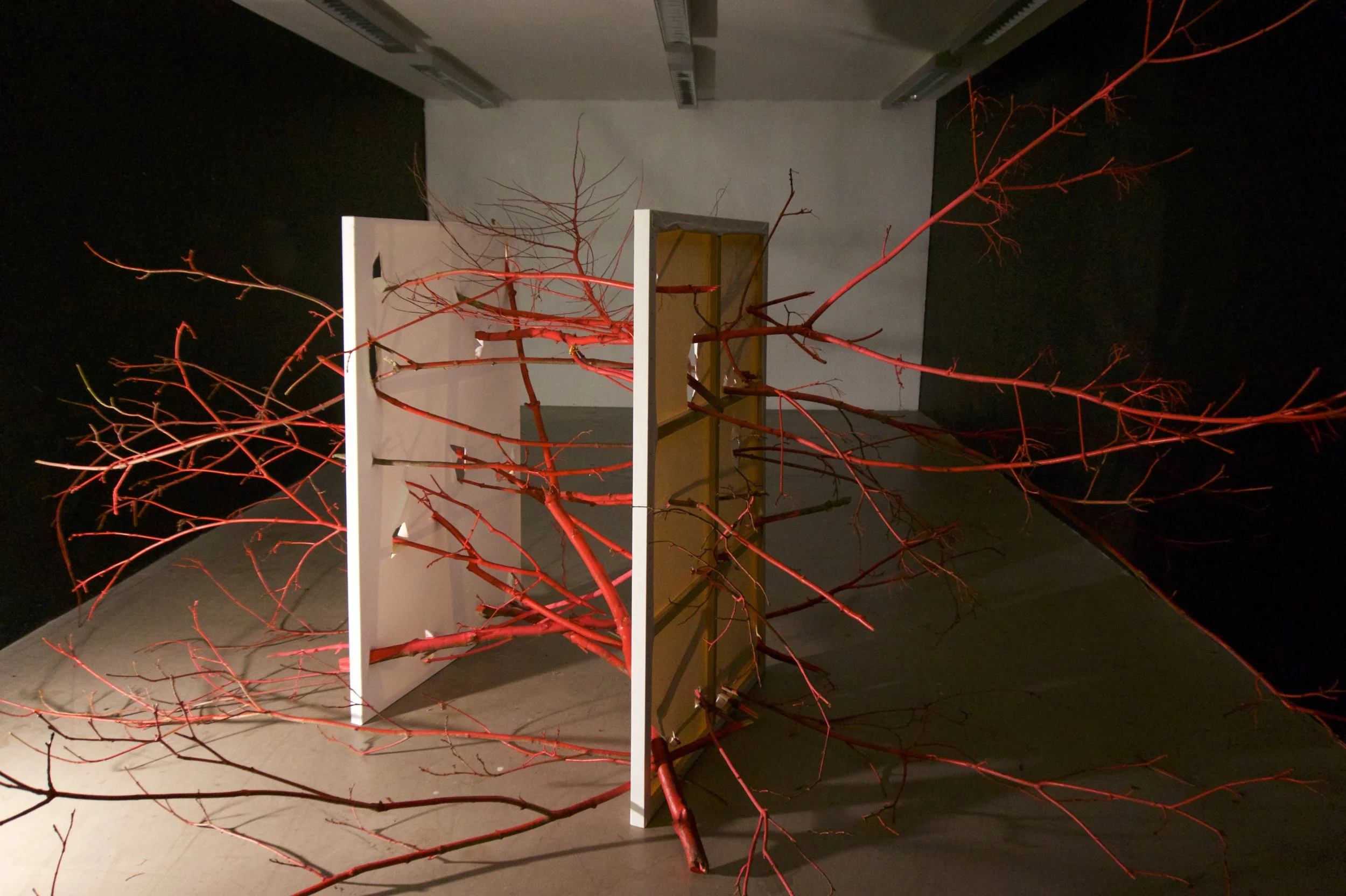

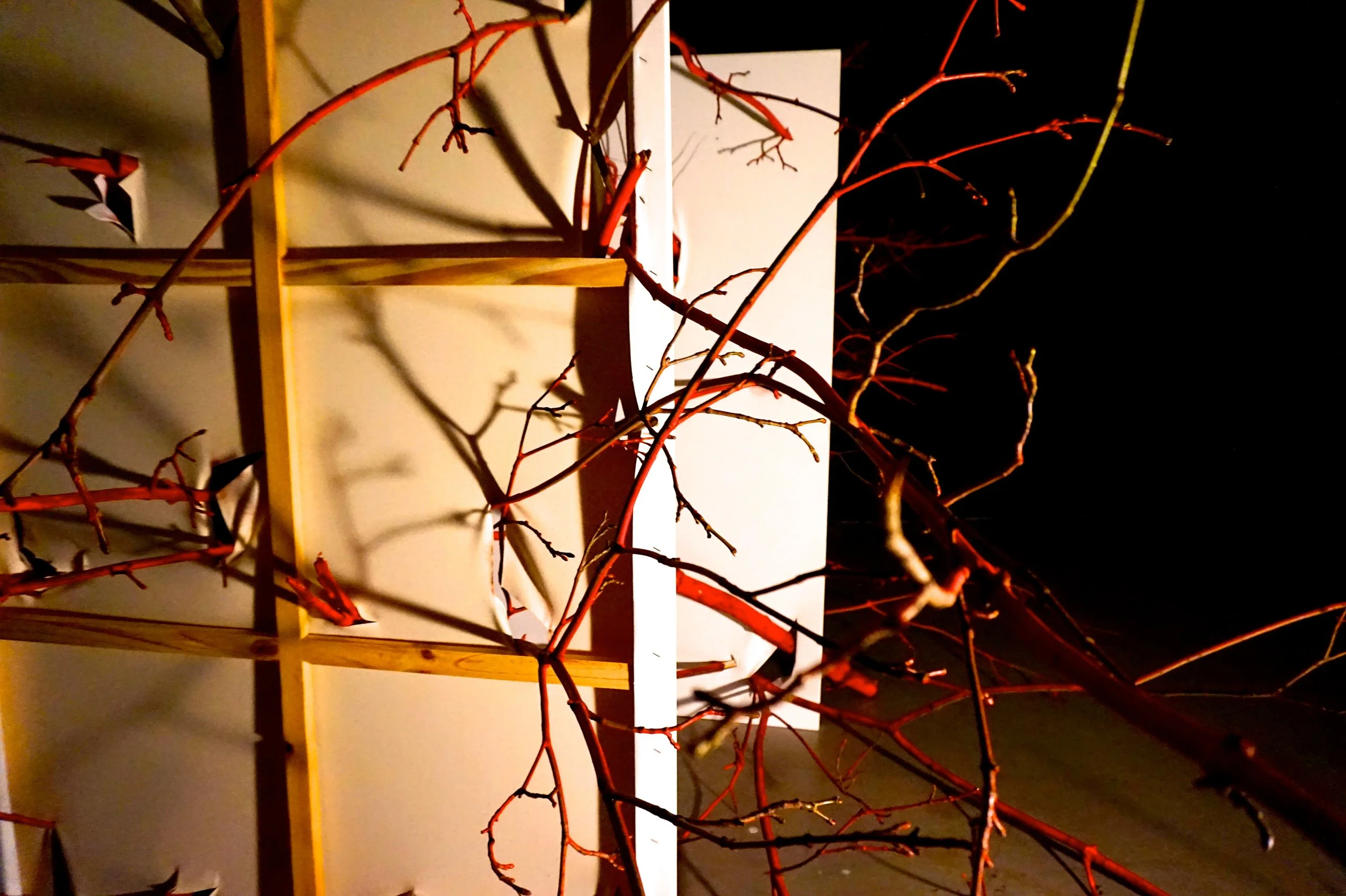
CHAPTER THREE: 50% (2016)
(Installation with Canvas, acrylic, spray paint, broken branches from local areas)
50% is one of what I hope to be my most simplistic yet, effective ideas. Involving two canvases and nature. The installation will play on a story I was told when I was younger.
When I was first diagnosed, the hospital ran blood tests throughout my family members to test for carriers, and to find the origin of my condition. In some weird way I likened this investigation to that of a family tree trace. Going back through the roots, weeding up the luminous bulb of truth and discovering; this is where my XLA began.
The branches operate as a method of exploration, sweeping and searching for the knowledge. The way in which they thin out and bring the life force to the structure, I see them very much as veins and arteries of the work. I always envisioned the canvases as a barrier of protection, a clean slate ruined and interrupted by the sudden unearthing of a family symptom.

CHAPTER FOUR: 1992[THE PROTECTOR] (2013-2014)
(Acrylic on canvas)
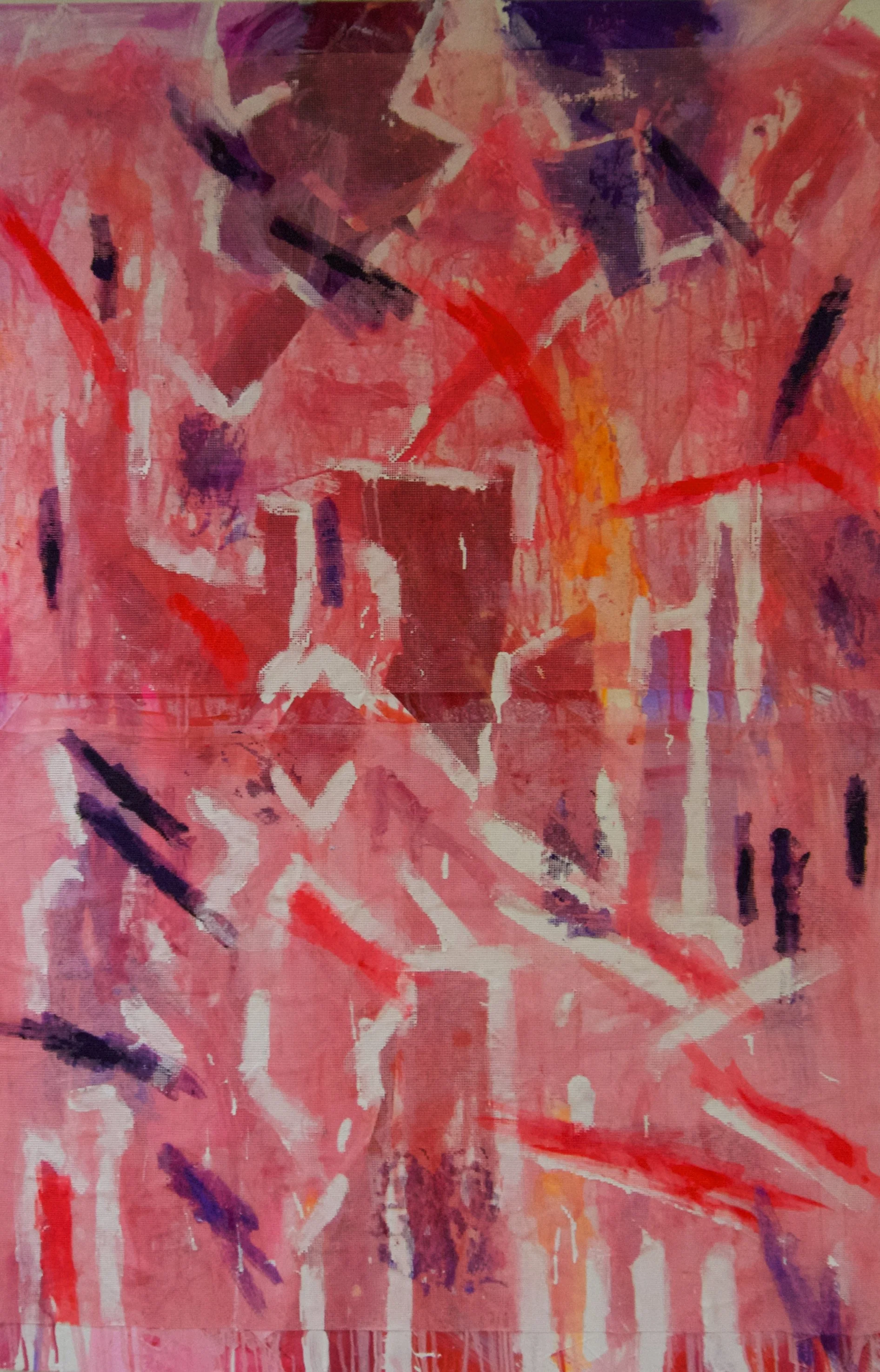
1992 was a concept for a painting I've held onto for years. It's based on the protection that a mother has over her children and how even biology can create a false sense of security.
The painting depicts a surreal triply landscape of twisting shapes and sections, with bars of black and white dotted across it. The bars represent a sense of security, whether it be a shelter you need of not.
When I was first born, I was not diagnosed until I was three. I was born a healthy child and as time went on, I lost the white cells my mum had given me and became gradually more unwell. The pink and blue circles that forefront the painting show how my growth meant the deteriorating cells I had left. That the protection had gone within me. In reality though, if it hadn't been for my mum's perseverance and strength, her protection, I wouldn't be here today.

CHAPTER FIVE: Breathe (2015)
(Acrylic, Indian ink, chalk dust, acetate, printmaking ink on canvas)
Breathe is a side project which was originally an after thought of the process that went into my painting Bronchitis (2012). During the research of my lung and breathing issues back in 2012, when I was developing a painting based on having some bronchitis in my lower right lung, I also came up with an idea to explain how it felt having a cough, or going for a lung function test when I was younger.
These days, my chest doesn’t give me much bother, so it was strange to reflect back on a time that it did. When I was younger, I would go for lung function tests, with different breathing apparatus and machines, and it would always leave me tired. I wanted this painting to have a more fuzzed and bleaker effect, to represent how I used to feel at the time.
The sharp pink silhouette in the painting is the idea of finally getting some relief and being able to breathe better as my life went on. It changes from the more dark and dry feel that Bronchitis gives off, which is why I’m glad I split the ideas back in 2012.

CHAPTER SIX: Frostbite (2015)
(Acrylic on Canvas)
Before the days of home therapy, I used to attend hospital once every three weeks for a full day treatment. During this time, I went through different methods of transfusion, including a port-o-cath and the eventual shot at my veins; giving me my IgG intravenously.
In all honesty, the veins were very hit or miss. Sometimes it got so bad that a special numbing spray was used to numb areas of the skin so that I didn’t feel the needle used. This was back in the 2000’s when I used to have a phobia of needles and all sorts of sharps.
In the painting, Frostbite, I’ve used a series of abstract shapes to show the attempt at hitting ice cold veins, how sometimes the doctor would hit the target, and other times, could miss. The blurred and scattered background of the painting is a definition of when eyes are almost closed, and lights stretch and blur upwards, this is what I sometimes seen when someone was trying to find a vein as, back in those times, I couldn’t bring myself to look.

CHAPTER SEVEN: Appendix (2015)
(Acrylic, cereal photographs, Indian ink, charcoal and pencil on canvas)
When I was 10 years old, I went through the routinely average, and trippy experience of getting my appendix removed, just hours before it could have burst. Besides a strong hallucination of spiders during the night post-operation, the removal of my appendix will always forever remind me of cereal.
The day after my appendix removal, when the doctors and surgeons did their rounds and stopped by my room, I was having a cereal for breakfast, and was shown pictures of my appendix being removed from my belly button, keyhole style. I remember my stomach looking like a helium balloon and something horrid rising into what looked like the fancy end of a Dyson hoover.
Appendix is a recollection of these events, and I took to the idea of showing different images in succession of one another, in the nature of which I was shown photographs. With a mixture of both cereal orientated structures and bacterial images, and with white webbing shapes covering the foreground, I found Appendix to be a representation of both cereal and the effects of morphine.

CHAPTER EIGHT: IgG (2013-2014)
(Acrylic, Indian ink on canvas)
For someone in the business of injecting themselves once a week, I am really thin skinned when it comes to needles. They give me the feeling of watching a horror movie on your own. However, in growing up, and with the possibility of freedom from a hospital bed once every three weeks, I learnt how to perform my infusion on my own.
IgG is a direct response of how, creatively, I imagine how that my infused plasma of white cells have a battle inside my body to form resistance. The dark background indicates how my imagination can be unsure of human anatomy, and the almost, church glass like orange and warm sharps are representative of the orange butterfly needles I used when I first started. The coloured situation holding the centrepiece of the painting is how I imagine the cells to gather, forming together, maybe not all at once, because nothings perfect, but to start to collectively prepare to fight off infection. The white circular shapes floating around the painting are the sites in which I infuse, R1, R2, R3, R4, LI, L2, L3 and L4… where would I be without you?

CHAPTER NINE: The Parent Trap [Part 1 of 2] (2015)
(Acrylic, spray paint, ink on canvas)
When coming together with the idea of eventually showcasing XLA, I would be extremely ignorant to not acknowledge life living with XLA itself. I find that a lot of people are blind to the fact that people, who have additional struggles, for my own example, living with a life-long disability, have to also go through rough times personally, not just medically.
The Parent Trap is how I viewed the very personal topic of my parents divorcing when I was around 14. The painting is more an account of recollection; thinking of all the things that would push someone out of your life (a notion that most are at least somewhat knowledgeable of). As with a lot of my work, I used my creative to push out the dark parts of those years. I found it important to get rid of a lot of my hurt towards the situation and came up with the idea of having the painting be part of a two-partner, The Parent Trap being the darkness before the light.

CHAPTER TEN: Running With… [Part 2 of 2] (2015)
(Acrylic, ink and pastel on canvas)
Running With… picks up where The Parent Trap leaves my younger self, and throws the shadows up and kicks them out. I find that there comes a point in life where you have to stand up for yourself, if not independently then at least as a group.
I like to think that Running With… poses the question of allegiance and sides, in a primal way of sticking to a group or squad. As though the painting was to suggest that, in order to get away from bad situations, you should really run, run as fast as you possibly can. It’s the easiest way to make the bad seem small.
I took a lot of inspiration for both The Parent Trap and Running With… from the books written by Haruki Murakami, and how he depicts relationships in his books, sometimes as tethers to solutions. The title of Running With… came from a quote in his novel “What I Talk About When I Talk About Running”
“Here it is: Pain is inevitable. Suffering is optional. Say you’re running and you start to think, “Man this hurts, I can’t take it anymore.” The hurt part is the unavoidable reality, but whether or not you can stand any more is up to the runner himself.”

CHAPTER ELEVEN: You + I (2015)
(Acrylic on canvas)
“So I’m experiencing heartbreak. It is unbearable to have to feel this way at the cost of another person. Romance with people and Romance with talent are completely different and wickedly similar at the same time. I can’t hurt my talent. Unless I was to never pursue it again.
Which I have been doing…
I’ve not lifted a paintbrush since June.”
- Written extract by Michael Wight (October 2012)
You + I is based on relationships, and finding those people in the world that you can confide in, the ones who will listen to you at 4 O’clock in the morning. Back in 2012, when I had to pull out from studying, I poured all my thoughts into a written project. Re-reading some of the extracts gave me the emotional reminder of my mindset back in October 2012 when a lot of things were falling apart.
The dark colours used in this painting were a direct result of looking back at a small painting I created back in 2012 “Urban Studies No.3” The ways in which the recently applied brushstrokes are dragged across the canvas are to represent the sometimes-dreary weather we all experience as Scots.
I see this painting as my representation of love, relationships and trust. People are dark and mysterious and not knowing whom to trust can be difficult. I suppose that’s what leaps of faith are for.
CHAPTER TWELVE: Dirty Swine Part.1 (2014)
(Acrylic, Indian ink, watercolour, oil, charcoal, polythene sheeting, spray paint on canvas)
Dirty Swine, a project originally called Psoriasis, is a two part piece of work, with a painting describing the possible solutions and methods for treating a skin condition, and an installation, showcasing what I imagine it too look like up close.
Dirty Swine Part.1 is a painting based on treatments for skin disorders. The large fluorescent colours in the background, with the vertical lines of purple are to signify the use of UV rays to soften down the redness of the skin condition.
There is also a large polyethene sheet, which stretches itself across the canvas, in an attempt to cover and almost conceal what’s going on beneath. I liked the idea of the polyethene sheet being sprayed with white spray paint before acrylic was applied, to allow the material to crack and show breakage. This is a strong symbol for dry skin, when it seems no matter what kind of moisture will bring softness.


CHAPTER THIRTEEN: Dirty Swine Part 2 (2013-2014)
(MDF board, polythene sheet, dried acrylic flakes, chalk dust, acrylic installation)
Dirty Swine Part.2 is the exposure of living with a dry skin condition. Sometimes you can sense that nobody else is paying attention to it; however from a personal point of view it can always seem worse than it is.
This installation, made up of an abstract shape of MDF boards, and a long trailing and shedding sheet of polythene depicts how even though something may look delicate or fragile, there is a strength, almost hidden to what lies beneath its surface.

CHAPTER FOURTEEN: Berlin (2013)
(Acrylic on Canvas)
Berlin is a painting that shows a more simple and loose side to my work. The large bursting background of colour was a reference to my time away from Edinburgh. I felt that I could have travelled forever when I was in Berlin and being so free in a new environment, I could have stayed there for much longer. I went when I was in college for an art trip to see as much art as possible, and it was my first time abroad.
Walking from one side of Berlin to the other, and back again, I found myself sketching oddly from one place to another. It’s was strangely not until a year later after the trip, that I took the sketches out, pulled them all together into a new image that I had the loose shapes that would form a cover for the fun and wishing fulfilment.
When I was in Berlin, I found that there was a voice for art that isn’t seen in other places. The graffiti is loud and gracious, the atmosphere is filled with a sense of wonderment and the galleries are on another level entirely. From seeing the Gerhard Richter: Panorama to being lucky enough to enter Kunsthaus Tacheles, the whole experience of filling my days with art that was consistently changing and all different made me ecstatic, and has probably influenced my work and its ever changing style to this day.

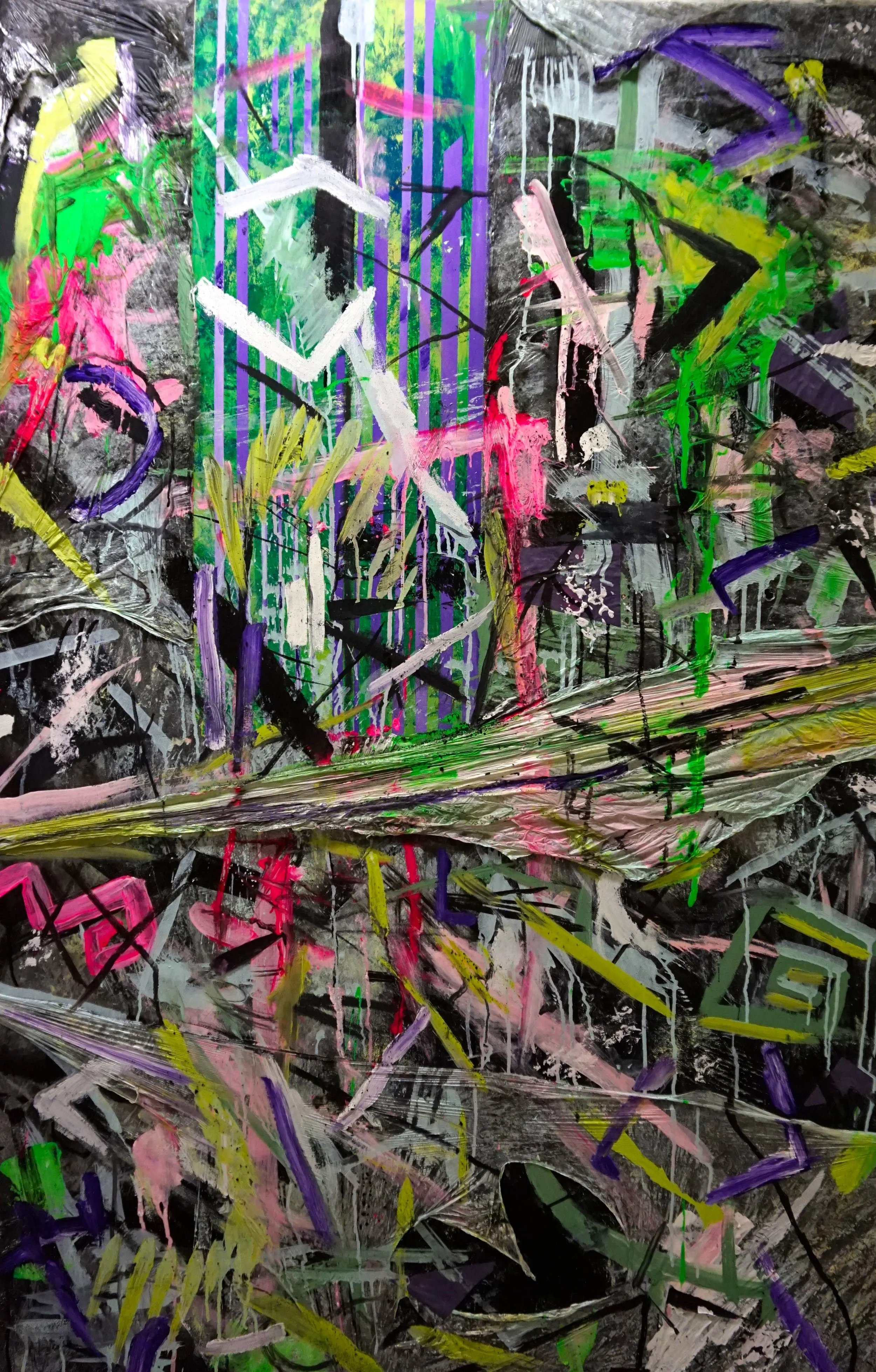
CHAPTER FIFTEEN: C8H11No2 / EUPHORIA (2014)
(Acrylic, Indian ink, pencil, pastel, chalk, ink on canvas)
In 2012, at the end of a year in Edinburgh College doing a diploma course in Art and Design, I participated in one my first group shows. I had done work previously for the Edinburgh International Art and Film Festivals respectively, but they had been purely collaborative work through high school at the time. This in my eyes was the next step up; the next move and with it came so much desire and pressure to achieve something special with a message.
Personally, this is where the whole idea for XLA was born. On that day back in March 2012, when I sat down and wrote a whole treatment for a huge exhibition of many works of art; describing words and small sketches all came flowing out of me that day. And so throughout my final confirmatory project at college, ending with an opening night to the exhibition in June 2012, I had produced a small body of work that really kicked off the work based on my medical history.
I can guarantee that if I had decided to draw sailboats that day back in March instead of working out a way to demonstrate living with an infection (see Adapt to Contact, installation from 2012’s Everything Before), I would not be here today with a series of work, and I’d still be living with a lot of unnecessary thoughts and fears regarding my condition.
C8H11No2 is an example of how joyous I felt during the group show in 2012. Working with other fantastic artists, bouncing ideas of one another and coming up with unimaginable solutions to problems in the studio was a time of pure prime feeling.

CHAPTER SIXTEEN: TELA SUBCUTANEA (2014-2015)
(Acrylic, acetate, printmaking paper [urban cutups] on canvas)
Tela Subcutanea, or as it was originally called, Blood In The Tubes, was an important painting for my own peace of mind. A canvas based around the theme of the coincidence of me drawing back on the syringe during my transfusion.
Tela is based on a moment that destroyed me. It took all the pressures of moving away, all the opinions, the emotions and the complications and hit me with one colour. A pale red, spreading down a clear tube into the solution of white cells. It send a thousand panic movements to my brain, caused me to freeze in shock retreat and become an open book of pure exhaustion for a good 20 minutes.
The mask had broken, and my confidence shattered. I have honestly never felt so betrayed by my own body, so vulnerable and detached from everything around me than I did in that singular moment. All because of one mistake, and it all happened the day before I was meant to make a final decision on whether or not I went to University.

CHAPTER SEVENTEEN: CHAOS ITSELF (2015)
(Acrylic, Ink, watercolour, bin liners, tissue paper on canvas)
Chaos Itself if based on the idea that sometimes people create their own disasters, even if they aren’t aware of it. Does chaos bring people together or just make them think they are?
The continual pattern shows how an overwhelming cycle of something so simple and continuous can be damaging. The idea of people escaping from their reality by doing something the same way over and over again as a way of avoidance and denial.
This painting is all about finding that sometimes you cannot rely on yourself to get it right all the time. Mistakes must be taken into consideration and even, cherished. Sometimes the best work, or the best solution, can come from a mistake made and a lesson learned.

CHAPTER EIGHTEEN: Broken (2015)
(Acrylic, string, matt, cardboard fixtures, marker, spray paint ink on glass)
I came up with the idea for Broken one day when I was sitting organising what we like to call “our medicine cupboard” at home. It’s a cupboard in our kitchen, where everything and anything is kept in relation to medicine. And it wasn’t until I was looking at old burst aluminium foil strips that I thought, some people live their lives day to day taking tens of hundreds of pills.
Broken is more about the similarities drawn between these broken strips of burst pills, and a container we have at home for taking medication at the right time, on the right day. It’s a reflection on scheduling, and keeping to a plan, in hopes that this small pill might save you.

CHAPTER NINETEEN: Ring of Fire (2015)
(Acrylic, ink, cardboard on canvas)
“In hindsight, I’m not sure if people ever really grow up and mature, or if we just get more responsibilities as life goes on. “
Ring of Fire’s title comes from a drinking game, my friends and I know all too well. However, the paintings idea and concept comes from a deep gratitude to all those I call friends.
Back in 2012, after the group exhibition at college, after the acceptance into University, I was on a creative high of sorts. I remember being so happy and delighted to be moving away from Edinburgh, go on an adventure like my time in Berlin, and learn lots more about art practice.
Ring of Fire shows one of our house parties, in which I spoke with my friends about moving away and University life. My hopes for the future were very bright and exciting, and in this painting, I wanted to get across a more mature palette of colours.

CHAPTER TWENTY: BODY BETRAYAL (2015)
(Acrylic, ink, gloss on canvas)
Something strange happened while I painted Body Betrayal over this past year.
When I originally planned this painting out, I had intended it to be a painting that represented disappointment with myself and how when I’m unwell, I truly am knocked out with whatever bugs it is. With my condition it just does hit me harder.
However, during and throughout 2015, I’ve been in and out of hospital with infections, and at some point it all really hit me, that I should instead be a lot more thankful that my body brings me through it all.
So in turn, the painting became a more positive outlook on the way the body rejects bacteria and infection that can cause harm. The painting has a large written transcript about how infuriating it can be sometimes to have someone or something (body, I’m looking at you) let you down when you need it most. The written piece was copied from one of my favourite films, and watered down ink was used to cover the canvas in the text. I covered it with a blast of colour, and shapes based on how bacteria samples look underneath a strong light or lens.

CHAPTER TWENTY-ONE: rage [COMPRESSED DREAMS] (2013)
(Acrylic, Indian ink, Ink, chalk, pastel, tape, string, pencil on canvas)
Rage [Compressed Dreams] is possibly my favourite painting I have done so far. I feel like this is purely down to the fact I painted it in the moment it was based around. A lot of my work is based on self-reflection into the past and how I viewed it then/ or how I view it now. Rage, was painted around the time I really felt the anger and frustration in missing out on going to university.
A lot of things fell through near the time, far too many things for it to feel like a safe and secure move upto Aberdeen. I went from heading up to university, with a plan to continue my art and develop to suddenly, at home, unemployed with nothing going for me at all, and a traumatic experience to handle. I remember buying this canvas off the last of my money at the time and pulling out all the paints I had, and just going at the painting, brush wild.
I wanted rage [Compressed Dreams] to come across as a cry for help, just as much as a way to vent out all my frustrations about the situation I was in. The string across the canvas is to be seen as a constrictor to the paintings more colourful and optimism. A viewpoint in being held back from something you desire the most. The painting showcases the hardest thing I have ever had to do: put my creativity in a box and look for a way to earn a wage and living immediately.

CHAPTER TWENTY-TWO: Temporary Adjustment (2013)
(Acrylic, pastel, ink, cling film, dried emulsion and gloss on polythene on canvas)
Temporary Adjustment was based on my way of moving forward with my life after not going to university and continue my art. When first coming together with a plan for XLA, I actually intended for Temporary Adjustment to be the final in a series of 10 paintings. When it came to be that I wouldn’t have an opportunity to show the work for another year, I worked hard on a restructuring of the collection to bring more elements of my life and more stories to the table.
Temporary Adjustment’s canvas was actually one half of the painting I created in my college exhibition called “Port-O-Cath” once it had been stripped of the previous work and painted over. The canvas itself shows how I view holding up, getting with it and perseverance. The polythene sheeting with dried emulsion and acrylic covering it, adds together elements from some of the previous paintings, it also represents how I patched things up and continued on with life.

CHAPTER TWENTY-THREE: KIMONO: The Thin Sections (2015)
(Acrylic, card, matt, Indian ink, hot glue, pastel on canvas)
Kimono: The Thin Sections is a study on personality traits, friendship and rock formations. A strange combination, that all tied together quite sweetly when Kimono came to be.
While going through my time of pulling out of going to university, looking in hindsight, I became a bit bitter to those around me. Kimono’s shape, and design, with the large sharp protruding points, reference in a not-so-subtle way how I was a little sharp mouthed.
The colours and design of Kimono was taken from discovering thin sections (laboratory prepared formations of rock, viewed in a minuscule way through microscope).
CHAPTER TWENTY-FOUR: Blood Banks (2015)
(Acrylic, layered emulsion/gloss, hot glue, mesh and pencil on canvas)
Blood Banks, was seen as, and was always going to be, the most or more somber painting in the collection. Its originates from photographs I took back in March 2015, and in finding some of the shapes and structures appealing, I crossed the design over into a painting. The simplicity in the design of the painting is to show, how home therapy became a simple life addition, away from the constraints of hospital time, and the mesh is to represent those who taught me, and who supported me to change.
Blood Banks is based on my transfer to home therapy. When I was at the end of the line in hospital for my treatment, and it was becoming more of a setback in my teenage years, home therapy was brought up and introduced.
Freedom followed. Through my two home therapy nurses, Debbie and Gail, I learnt how to transfuse from home. Was it once a week instead of once every three weeks? (Yes) Did I have to set-up and transfuse myself? (Yes) But, did I start to become more social and not feel like something fragile in a box?
Yes.
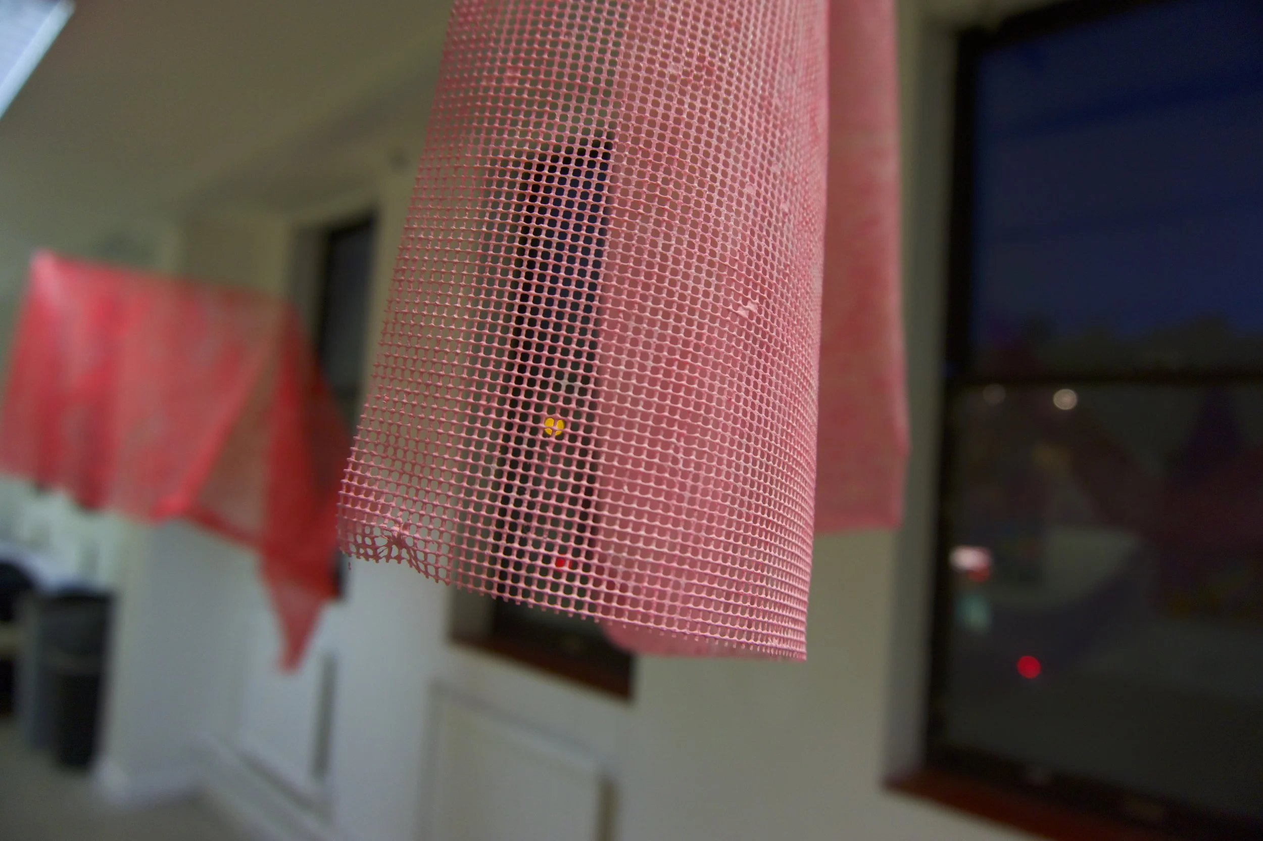


CHAPTER TWENTY-FIVE: Blood Banks: An Abstract Bruising (2015-2016)
(Acrylic, ink, water, thread on measured mesh)
While creating Blood Banks, I found that working with the dyed mesh gave me a new and exciting idea for an artwork.
By dying the mesh and hanging it from above, I found myself creating shapes that were not permanent and could change each time that they were displayed. I like the idea that people will not see the same shapes twice with these pieces of artwork…
The colours were based on bruising patterns, things that can be quite frequent when you get blood tests quite often. My middle name should be peach, because I sure bruise like one.

CHAPTER TWENTY-SIX: Sights (2015)
(Acrylic on Canvas)
“What you’re feeling,
Is what I’m feeling too,
What you’re made of,
Is what I’m made too,
What are you afraid of?
I know that you are.”
London Grammar
Sights is a painting based on how frustrating impaired vision can be. I’ve only had a few issues with my eyes over the past few years, mainly down to a skin issue, but having tired eyes can sometime leave you feeling like what your seeing isn’t the full picture.
Sights is a large combination of vision related sketches I’ve made over the past few years (looking into a light with your eyes closed, eyelids and temperature) and I kept coming back to the idea of a circle, strong and halo-like above an irritated and crushed background.
CHAPTER TWENTY-SEVEN: Dead Set On Not Going Crazy (2015)
(Acrylic, ink on canvas)
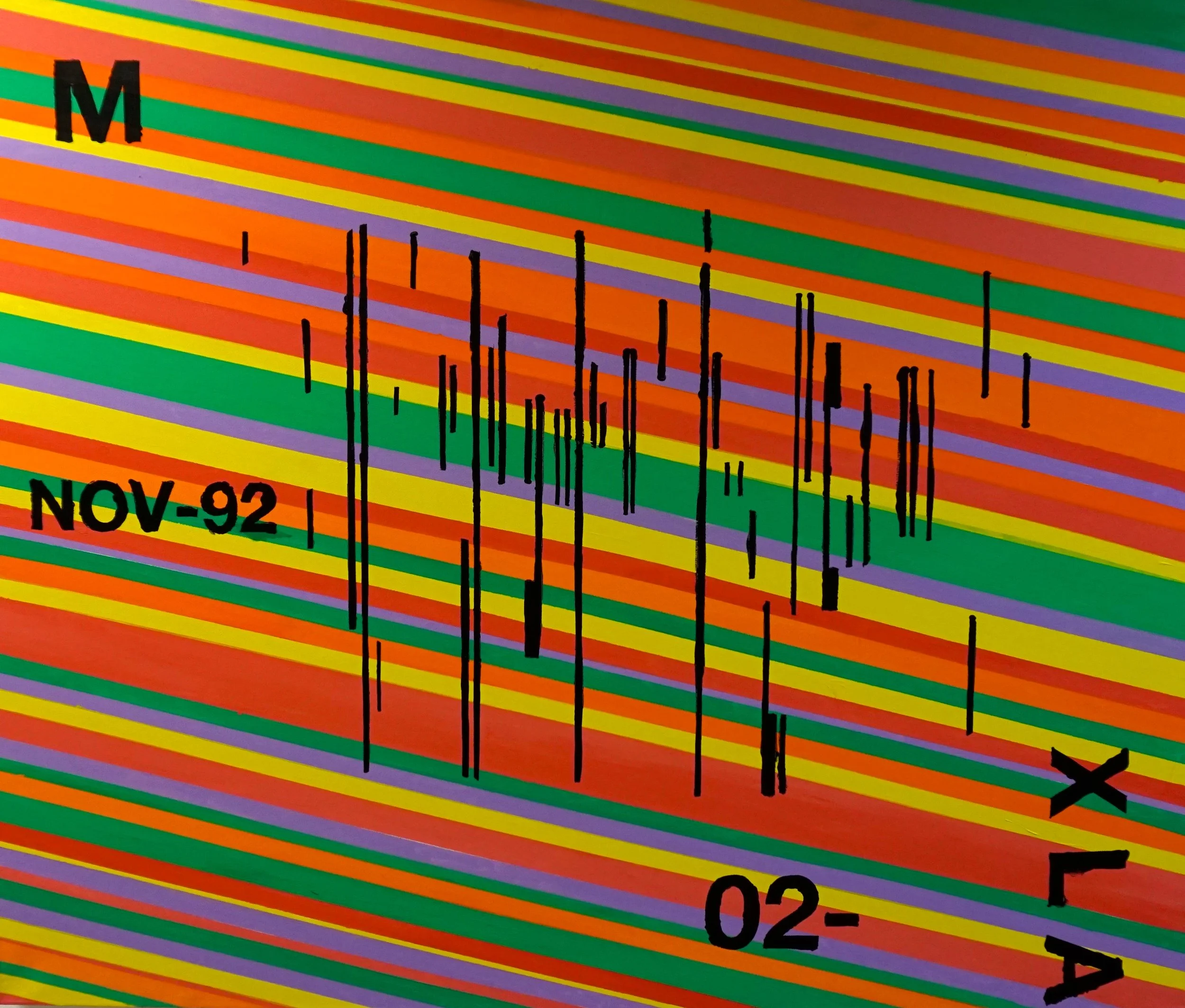
Dead Set On Not Going Crazy (or as I refer to it in short as DSONGC) was an important painting for me in the year of 2015, as it was painted after I regained some of my health back after a short stint in hospital around March time.
It was my first time being admitted into hospital since I went on home transfusion around 10 years prior (if that’s not a promotion for it, I don’t know what is), and my first time being in an adult hospital. Whilst there, I was given the usual name wristband, with my number and my barcode. Now, after all my years being admitted to and from hospital, it took my ageing mind to really spend a lot of time focusing on this idea that I was literally a number, a barcode, a box on a checklist.
Dead Set On Not Going Crazy is a satirical look on how I spent my time in the ward, thinking up colours and designs in a room that was meant for hygiene and treatment, not for my mind to dream up a new painting. The text on the canvas are some of that from the wristband, along with the large colourful stripes, to represent that new mindset of mine; stay motivated, stay keen, don’t get down about it, get on with it.

CHAPTER TWENTY-EIGHT: FREEDOM 60 (2015)
(Acrylic, glue, Hizentra product packaging on canvas)
In 2015, my method of transfusion changed. A few months back, I was given a new machine, which is quicker and allows for more mobility. Besides the fact that the new needles look like they could be used on a Star Wars set, I feel that advances in technology, no matter how big or small, have an impact on lives.
In a sort-of tribute to home therapy and how greatly it has affected my well-being, I decided to create Freedom 60, which is also the name for the machine I now use at home for a quicker infuse rate.
To add an extra mixed-media effect into the canvas mix, I put down a base made up entirely of Hizentra product boxes (the boxes I receive my medication in). If looked at close enough, the lines and shapes coming from the boxes form a pattern and the boxes under lying braille might even show up…
CHAPTER TWENTY-NINE: FLAWS X VISION (2014-2015)
(Acrylic on canvas)
When creating Flaws X Vision, I remember thinking back to my original theme for the project; in which everyone is somewhat flawed and perfection is a hard thing to strive for or ever attain.
Flaws X Vision is an interpretation of what I initially sketched back in the start of 2015, after a visit to the Eye Pavilion in Edinburgh. Strong bright lights where shone in my eyes, and whether or not it was a trick of the sight, the colours were very impactful and I tried to re-create them on this canvas.
The imagery in the painting once again refers to a battle of the immune system versus infection, with the infection (the incoming swarm from the right side of the painting) heading towards the small yet stable, and mildly transparent immune system defence.

AXIOM (2015)
(Acrylic, polyethene sheets, gloss, glue, ink, charcoal, pencil on canvas)
Axiom: “…is a statement (in mathematics often shown in symbolic form) that is so evident or well-established, that it is accepted without controversy or question. Thus, the axiom can be used as the premise or starting point for further reasoning or arguments…”
Axiom is the final painting in the XLA series, however I feel that it’s more of a starting point for something greater. I like that it incorporates a lot of the previous paintings styles, materials, and designs, to create the strange, loose hybrid of them all.
Axiom is something described as “accepted without controversy or question”, in a way, that represents all the paintings that come before it.
I didn’t make any of this up; I went through everything I’ve painted about.
It shouldn’t be questioned because its all happened, its done and over. I had the idea that getting my feelings and viewpoints out onto the canvas to stop my mind from going into overdrive. Some people don’t get that lucky to have that peace of mind, and I guess that could be where I look into next: something that isn’t looking backwards.
Looking forwards…